The AWA Logo – why a duck?
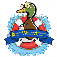
Our logo was designed by our dear friend and artist Simon Wallis, (Red One Creative Solutions).
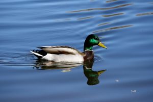
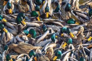
So why a duck? We chose a duck because we felt it symbolises so much about the waterways and about disability. The Mallard, which is the most common species of duck on our inland waterways, epitomises the proverbial ‘serene above the waterline but paddling frantically beneath the surface’.
The stunningly beautiful iridescent plumage of the Mallard drake is preened and kept in wonderful glowing condition, despite the mucky water of the bird’s world. This is highly representative of life with disabilities; the vast majority of us tend to put on a positive façade despite the struggles and adversity that we have to live with.
 We asked Simon to portray our Mallard drake in a life-ring to convey the concept that we all sometimes appreciate a bit of help in life.
We might be strong swimmers, but a flotation aid (symbolising a little assistance) will enable us to swim perhaps a bit further, more comfortably, more safely, or with less hard work. He is making a splash, because AWA wants to be making splashes to get the message out that our waterways should be accessible to all of us equally.
The image of the duck goes further than that though. We have recently learned that the duck can be symbolic of many things. Poignant to us are the following:
- Trust – we, as disabled people, often have to be willing to put our total trust in others at many levels and for many things. Those of us with assistance dogs soon learn to trust our beloved furry partners implicitly. This is, for most of us, very challenging and humbling.
- Patience – life with disability takes a lot of patience, not only on our own part, but also on that of those around us. Doing things with impairments takes longer and can often be very frustrating.
- Perseverance – we have all had to learn to persevere through adversity.
- Community – the boating world has a wonderful sense of community. Those of us who live on or visit the waterways appreciate the community around us.
- Adaptability – as our abilities change/deteriorate, we simply have to learn to adapt. Also, our homes (boats included) and the environment can be adapted to accommodate our needs.
- Supportiveness – we all appreciate the support of others around us, regardless of our abilities or needs. But those of us who live with challenges appreciate it all the more.
- Humour (We often think that the raucous quacking we frequently hear is much like uproarious laughter). There is nothing like a good sense of humour to help us through adversity. We don’t always achieve it, but most of us will face our challenges with as much good humour as we can muster.

So we would like to thank Simon for lending us his wonderful creative talents. The original thoughts behind the duck logo were well taken by him and brought into being in his design. This recent discovery of the various cultural significances of the quacker has just brought a new poignancy to it.
We may well incorporate the more classic ‘bath duck’ style character into our ‘corporate image’ as time goes on. This is simply because it is much more commonly available in all sorts of formats, whereas the Mallard is much more limited.
However, our Mallard in a life ring is our iconic emblem.
